How I Added an Animation to the Browser Devtools Console
You might have heard of colouring browser devtool console output with CSS or even using an image. But this post will take you through my journey of making an animated SVG and how I put it on my console window. Check out the dev tools yourself!

You can use all sorts of ways to add your own flare to the devtools console. Around the internet you might find:
The Simple
Using something like console.warn() or console.error() to colour the output based on browser implementation. Great for developer messages.
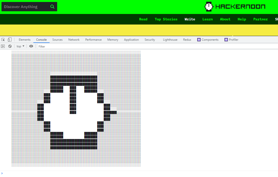
ASCII Art
The Classique. Old school but it works. Hit F12 on some of your more nerdy websites and you might just find a little bit of art peeking back at you. Check out Hackernoon who put their own watch logo in the console.
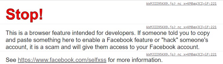
CSS
It styles your websites, and it sure can style your console. Facebook uses this to good effect, not for fun, but for security.
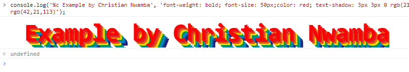
But self-owns aside, CSS can bring some fun and colour into your console. Taking the final example from How to Style console.log Contents in Chrome DevTools we can do something bold:
If you wanna see some cool examples, check out this post: Adding CSS To console.log()
CSS also allows us to put images in the console. Check out this fun post as a proof of concept. While that's cool, do you know what's cooler than images? Moving images. 👀
And that's where we go next.
Animations
This was a fun rabbit hole. These are the articles I used to get this going:
- Console.rules(💪) by irene.tomaini
- I made a discovery: SVG and SVG animations in the browser console are possible! by Erik Woods
- console.log svg animation by Viljami Anttonen
These three have fantastic examples and are easy reading. They also reference each other in a way that reminds me of:
Sadly I couldn't gifs going, but I did see that svgs were easy to get working for animations. Having only touched the file type properly in in the early 2010s, it was probably time to re-learn. This post isn't about how Scalable Vector Graphics work, but more what I did to get my own dev tools working with them. Which by the way if you haven't already, hit F12 and see what message I have for you 🤗❤️. (Might only work on Chrome, or maybe the spec has changed by the time you're reading this 🤷)
Code
The code itself is simple and mostly taken from Viljami Anttonen's example linked above. To my base template for this site I have the following:
// ┬┴┬┴┤ ͜ʖ ͡°) ├┬┴┬┴
fetch("https://www.nikouusitalo.com/assets/other/ConsoleMessage.svg")
.then(response => response.text())
.then(svgXml => {
    const svgDataUrl = `data:image/svg+xml;base64,${btoa(svgXml)}`;
    console.log('%c ', `
        background-image: url(${ svgDataUrl });
        padding-top: 200px;
        padding-left: 750px;
        background-size: contain;
        background-position: center center;
        background-repeat: no-repeat;
    `);
});
Just follows:
- Fetch the image
- Grab the text, since the
svgfile type is actually anXMLdocument - Get the base64 representation of it via
btoa() - Using the
%cformatter which allowsconsole.log()to apply CSS - Pass in the CSS
SVG
Graphic understanding, art, colours, and composition. I am the antithesis of these. I quickly realised that while I understand and use XML nearly daily, I do not understand how to... image🤷. Check out this post on basic svg animation for a quick peek at animations in svgs.
I then wanted to see what other people did and really liked this example from Patrick Young:
But that was too much for me. So while this may sound like a #ad, I ended up using SVGator.
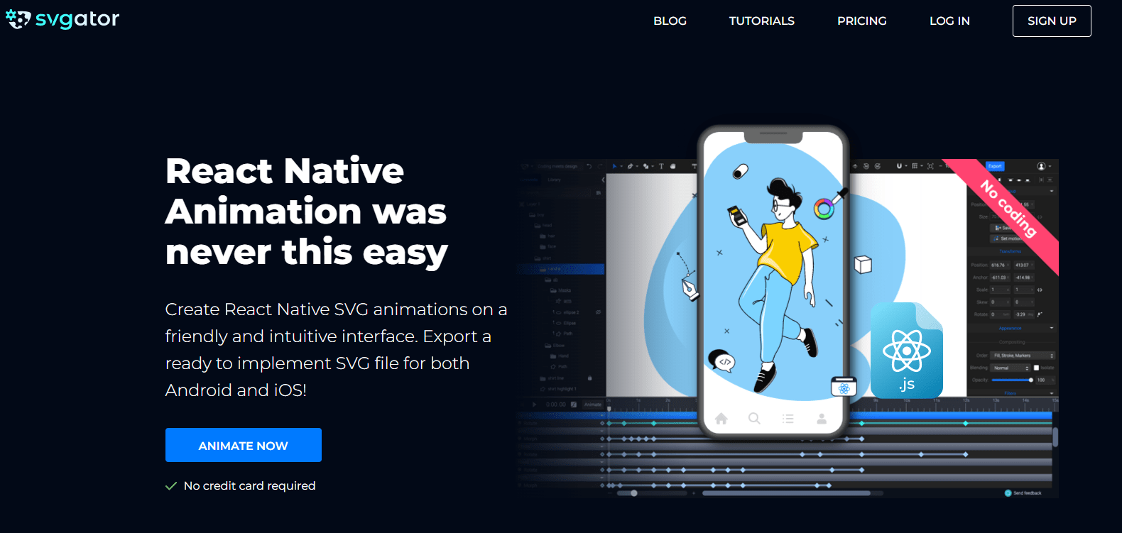
I ended up paying for the lite version from SVGator because I wanted one of the animation types. I think it was worth the learning and fun little animation.
The interface is similar enough to animation/film editing software. A couple of tutorial videos later and looking at the provided examples, I decided on something simple:
- A smooth and nice to look at colour changing background
- Text that also changed colour
Some really janky attempts being confused at colour palette generators and colour theory I ended up stealing the five colour gradient used in an SVGator example from this post:
 SVGator
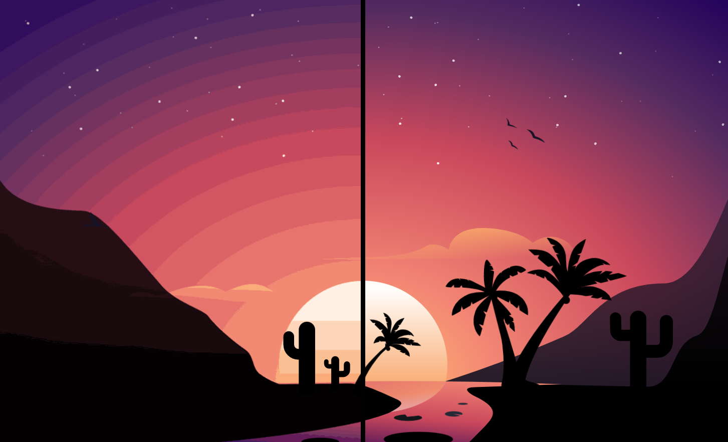
In the end my workspace looked simple, for my simple desire.
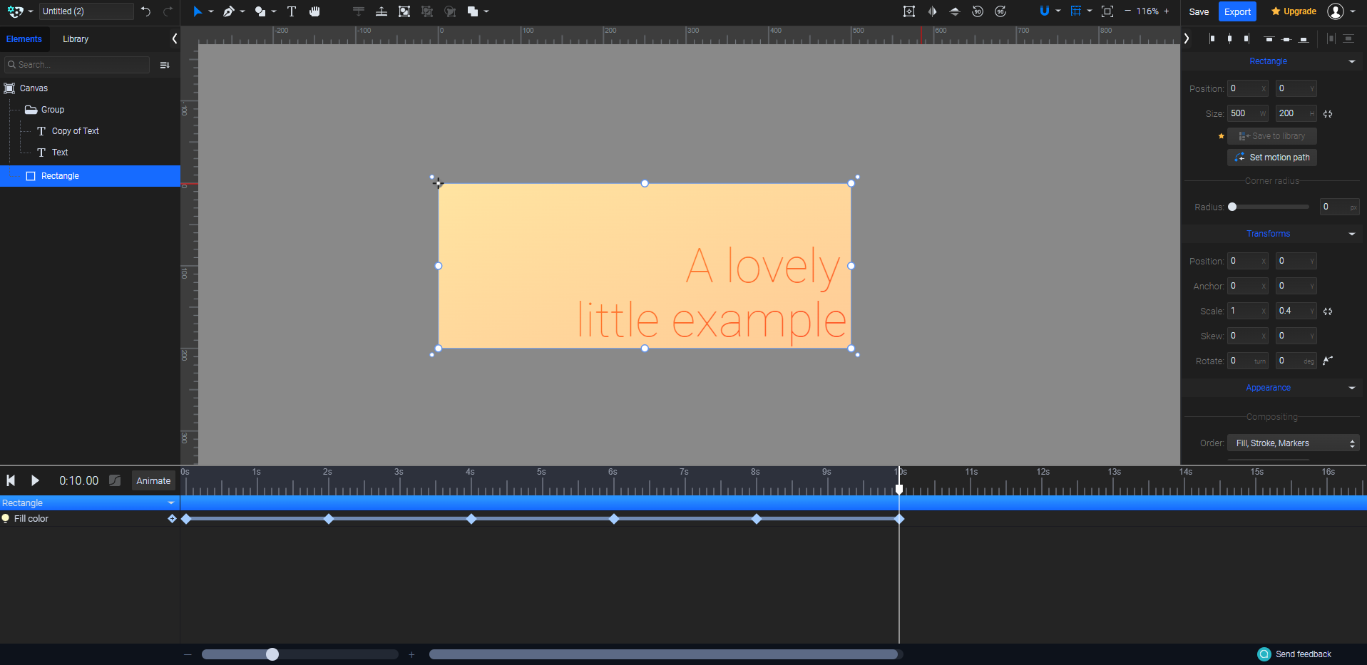
The final result:

So what goes on in this little svg? Let's deconstruct it and learn.
At about ~9KB it's probably smaller than the equivalent gif, especially with the constant colour changing. Earlier I mentioned it was just XML and if I remove some of the long winded bits and look at the core structure, it looks like this:
<svg id="eGpj07MITnZ1"
xmlns="http://www.w3.org/2000/svg"
xmlns:xlink="http://www.w3.org/1999/xlink" viewBox="0 0 500 200" shape-rendering="geometricPrecision" text-rendering="geometricPrecision" width="500" height="200">
<style></style>
<defs>
<linearGradient id="eGpj07MITnZ2-fill" x1="0" y1="0" x2="1" y2="0" spreadMethod="pad" gradientUnits="objectBoundingBox" gradientTransform="matrix(1.000076 1 -1 1.000076 0 0)">
<stop id="eGpj07MITnZ2-fill-0" offset="0%" stop-color="#ffe4a1"/>
<stop id="eGpj07MITnZ2-fill-1" offset="100%" stop-color="#ffcb96"/>
</linearGradient>
<filter id="eGpj07MITnZ4-filter" x="-150%" width="400%" y="-150%" height="400%">
<feComponentTransfer id="eGpj07MITnZ4-filter-opacity-0" result="result">
<feFuncA id="eGpj07MITnZ4-filter-opacity-0-A" type="table" tableValues="0 0.74"/>
</feComponentTransfer>
</filter>
<filter id="eGpj07MITnZ6-filter" x="-150%" width="400%" y="-150%" height="400%">
<feComponentTransfer id="eGpj07MITnZ6-filter-opacity-0" result="result">
<feFuncA id="eGpj07MITnZ6-filter-opacity-0-A" type="table" tableValues="0 0.74"/>
</feComponentTransfer>
</filter>
</defs>
<rect id="eGpj07MITnZ2" width="500" height="500" rx="0" ry="0" transform="matrix(1 0 0 0.4 0.000004 0)" fill="url(#eGpj07MITnZ2-fill)" stroke-width="0"/>
<g transform="matrix(.881698 0 0 0.881712-384.559633 20.896996)">
<text style="mix-blend-mode:color-burn" dx="0" dy="0" font-family=""eGpj07MITnZ1:::Roboto"" font-size="37.5" font-weight="100" transform="matrix(1.761631 0 0 1.761631 624.45995 186.480469)" filter="url(#eGpj07MITnZ4-filter)" fill="#9e3c3c" stroke-width="0">
<tspan y="0" font-weight="100" stroke-width="0"><![CDATA[little example]]></tspan>
</text>
<text style="mix-blend-mode:color-burn" dx="0" dy="0" font-family=""eGpj07MITnZ1:::Roboto"" font-size="37.5" font-weight="100" transform="matrix(1.761631 0 0 1.761631 775.062366 112.555797)" filter="url(#eGpj07MITnZ6-filter)" fill="#9e3c3c" stroke-width="0">
<tspan y="0" font-weight="100" stroke-width="0"><![CDATA[A lovely]]></tspan>
</text>
</g>
<style></style>
</svg>Not bad right? Remember you can always save the animated svg example above and open it your text editor of choice.
So what about those long winded bits? That's the CSS styling. Embedded in the above you can see two <style> tags, one near the top, and one at the bottom. They make up a substantial portion of the 9KB.
The first block helps with the animating and formatted looks like:
#eGpj07MITnZ2-fill-0 {
    animation: eGpj07MITnZ2-fill-0__c 10000ms linear infinite normal forwards
}
@keyframes eGpj07MITnZ2-fill-0__c {
     0% {
        stop-color: #ffe4a1
    }
     20% {
        stop-color: #ffcb96
    }
     40% {
        stop-color: #ffcb96
    }
     60% {
        stop-color: #d987d6
    }
     80% {
        stop-color: #388bee
    }
     100% {
        stop-color: #ffe4a1
    }
}
 #eGpj07MITnZ2-fill-1 {
    animation: eGpj07MITnZ2-fill-1__c 10000ms linear infinite normal forwards
}
@keyframes eGpj07MITnZ2-fill-1__c {
     0% {
        stop-color: #ffcb96
    }
     20% {
        stop-color: #ff9da8
    }
     40% {
        stop-color: #d987d6
    }
     60% {
        stop-color: #388bee
    }
     80% {
        stop-color: #ffe4a1
    }
     100% {
        stop-color: #ffcb96
    }
}
Keyframes and gradients. CSS3 put in good work.
The latter <style> tag is the text embedding. Because the text is rendered as text and not an image, the font data associated with it needs to be included. And without the text the svg comes in at around 2.6KB, or ~6.5KB smaller.
To Conclude
I had a great time having a deeper look into the cool things you can do with the browser console. Not all browsers are the same, and things might change by the time you're reading this. At the time of writing, this worked exactly as expected in Chrome.
Revisiting was svg file format was a nice side quest and I was really surprised at how powerful SVGator is and how much I wish those sorts of tools were more accessible/known to the regular developer. Though who knows, maybe deep in the frontend space, that's common knowledge 🤔.
I hope you enjoyed this post as much as I enjoyed writing it. And remember to check out the developer console for this site!