Looking At Pixels Part 1: Characters
Throughout my 20's I've had a here and there fascination with pixel art. It's both Game Boy nostalgia and fascination how much can be done with so little - a concept that finds home in my love for software micro-optimisations (very often unnecessary but very fun). Getting the most out of what is available is why I own the book Pro .NET Memory Management, really enjoyed reading Building a self-contained game in C# under 8 kilobytes and am too scared to play Shenzhen I/O, else I lose my job to a crippling micro-optimisation addiction.
Recently I started watching a pixel art Youtuber named Brandon James Greer. I really enjoy his and similar to me and this website - they're his hobby. My attention was grabbed by this video on Pokemon sprites:
It's also because of him through an animation tutorial and pixel art program review that I bought aesprite and used it for this post!
For part 1 of this series I'd like to take a look at character designs in two groups of Game Boy (Colour) games:
- Pokemon Generation 1 and 2, leaning on gen 2
- Zelda, both Oracle of Ages and Oracle of Seasons
Packed with nostalgia, similar constraints and top down with the same visuals, they make for great character analysis.
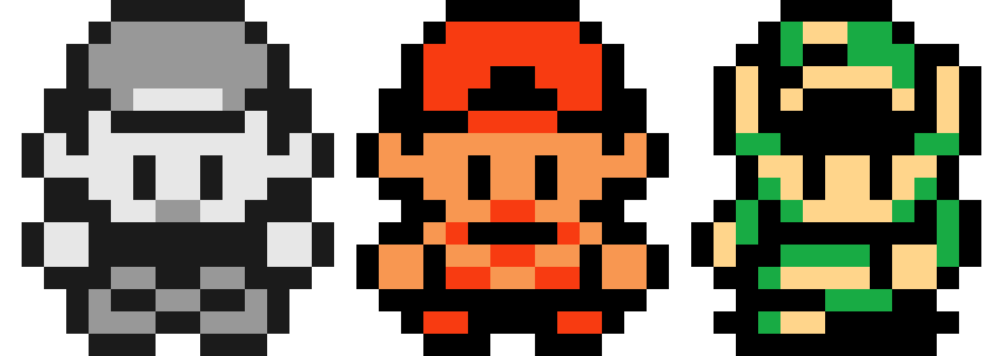
Sprite Credits to MisterMike, FrenchOrange, Polar Koala and SSM.
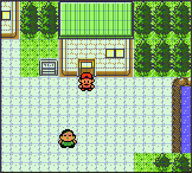
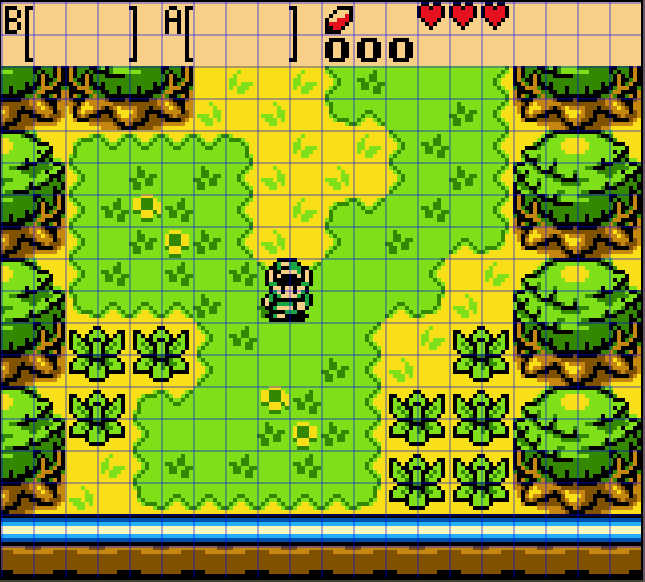
The Game Boy Screen
Both the Game Boy and Game Boy Colour have a 160 x 144 pixel screen and broken into 8x8 pixel tiles:
Anatomy
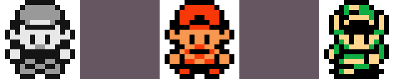
Let's look at the main characters up close and see what we can compare and contrast. Here is a side by side of our main characters.
Heads
Undeniably huge. Spanning about the entire width of a sprite and about 2/3 the height at 11px.
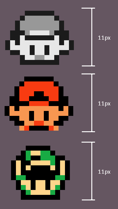
This would seem fair considering they top down games and as humans we process a lot of non-verbal communication through eyes and facial expression. While there is little space for detailed movements of mouths', a scrunched nose or furrowed brows - across all three we get space for:
- Eyes
- Ears
- A hat
Which are similar to the origins of Mario's look. From an interview with Mario's creator Shigeru Miyamoto:
We had to draw Mario as a small character and at the same time, we had to make him look human. To do that, we needed to draw a distinctive feature for him, such as giving him a big nose. We gave him a moustache so that we didn't need to draw a mouth. It is difficult to show facial expressions with small characters. We gave him big hands.
I find this is where the eyes and ears come in for our heroes - Link has his extra couple of pixel tall ears to show an elf-like look.
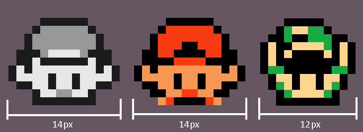
Looking at the side by side above, when their hands are in the foreground they are 2x2 pixels. If we compare hands to feet, hands are double the size of the 2x1 pixel feet. I wonder if this is because feet simply aren't that important to convey character, or it accents the top down look by having lower limbs smaller.
In another interview when asked about hair for early Mario, Miyamoto-san also states:
The technology of the time really dictated how we did character design. If I gave Mario a lot of hair you have to animate it or it doesn't look right. By giving him a hat we didn't have to worry about that. We also didn't have to draw his eyebrows, his forehead or any of these other things. It was just a really useful tool to help us emphasize what we were trying to do on this small screen.
Similar hat principles are employed with our three characters. With Pokemon, tapping into affordances of the 90's, the cap is an easy way to symbolise a normal boy. With Link, his floppy pointed hat brings an idea of something a bit more magical - a great compliment to his ears.
Just from heads we can grab a sense of who they are by using affordances/themes/stereotyping meaning we can jump right in without setup.
Body
There's not too much going on with the bodies, with 11 out of 16 pixels taken by the head we get 5 for the body, and 3 are taken by the feet and feet outlines.

We do however get a chance for simple patterns - and I find the most clear being on Link with his belt.
Animation
As with all sprite based games, we get great value from asymmetric frames. One lopsided sprite becomes two frames when flipped to create movement. Or another idle frame gets spliced in to create a much smoother animation.
Link is the most fascinating to me because many of his animations are two frames - the minimum for animated movement.
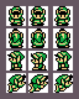
As link idles asymmetrically, his walking animation can simply be the idle sprite flipped to create frame 2. A big cut down on sprite saving, complexity and with the expectations of the Game Boy I don't think anyone cares and I don't think 10 year old me noticed the single-sprite-two-frame animation.
In Pokemon Gold/Silver/Crystal the normal walking animation has the idle frame twice within the cycle to give a smoother walk (when not moving sideways).
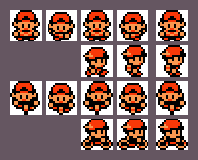
While generation 2 Pokemon uses four frames for movement, it just uses two sprites. Similar to Link, we as the character uses a flipped asymmetrical walking frame but then the idle frame gets used twice giving us a much smoother animation for twice the sprites and a nicer idle sprite.
I also really enjoy the horizontal bike movement animation. It's two frames and uses single pixel changes/movement exclusively.
- The head and body move by one pixel horizontally with the chin being hidden behind the hand and handlebars
- The pedal moves one pixel to the side and one down
- Each wheel has a single pixel that denotes movement
Conclusion
Our main takeaways for top down Game Boy (Colour) games:
- Heads are huge, 2/3 of the sprite huge
- 2-3 distinctive features, preferably mostly head based
- Asymmetry and mirroring is fantastic for animation
- Changing a couple of pixels or moving parts by single pixels is easily enough to create movement
I'm sure there is also a fascinating writeup on colour for the characters, such as how both use only three colours and how they can create designs, but that's for another time.